Challenge
At the time of my employment, Freddie Mac was building a new platform for customers to manage and track their application process and forms, the Unified Counterparty System.
I was hired to support the project, to both provide insight about user centered design principles and also to construct a style guide and build wireframes.
My challenge was not only to bring a user experience design approach to this portal, but also to overcome siloed thinking that was more focused on complying with engineering requirements than creating user-friendly interactions.
An attempt to model the entire relationship Freddie Mac has with their counterparty customer base
Solution
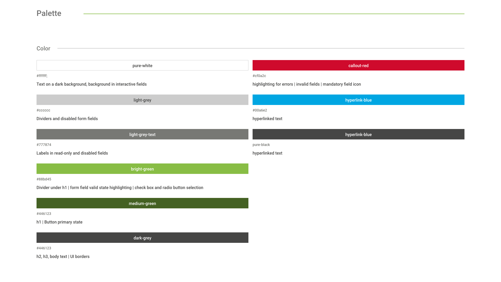
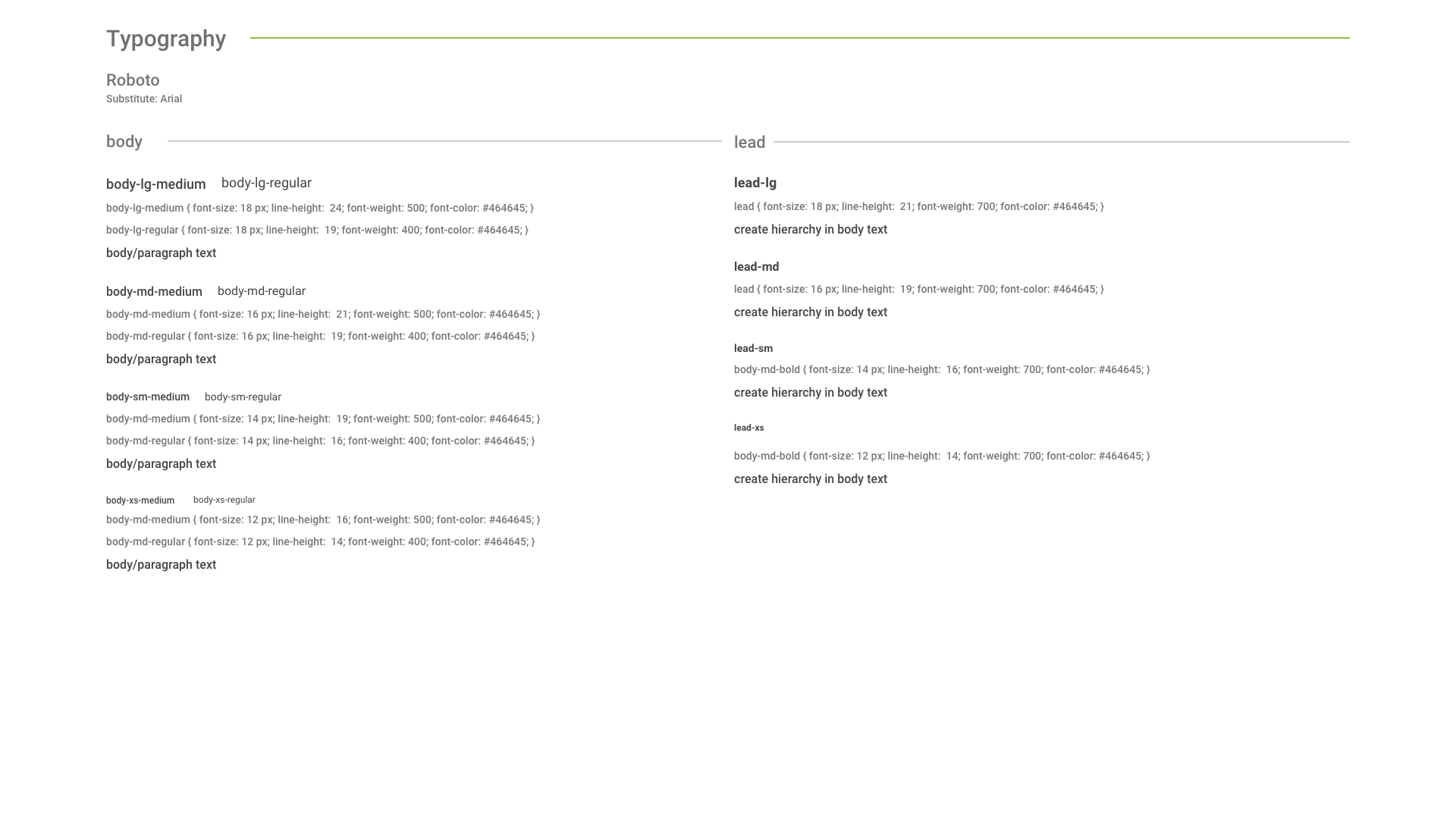
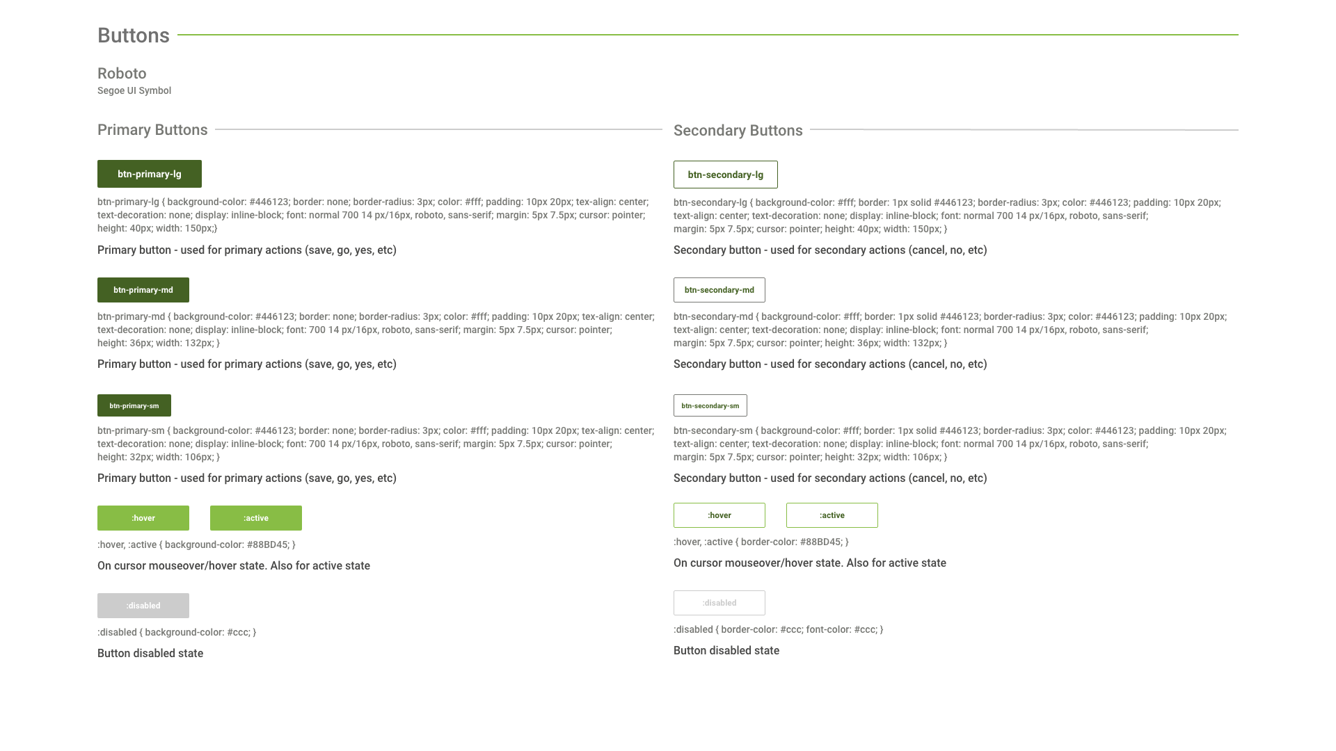
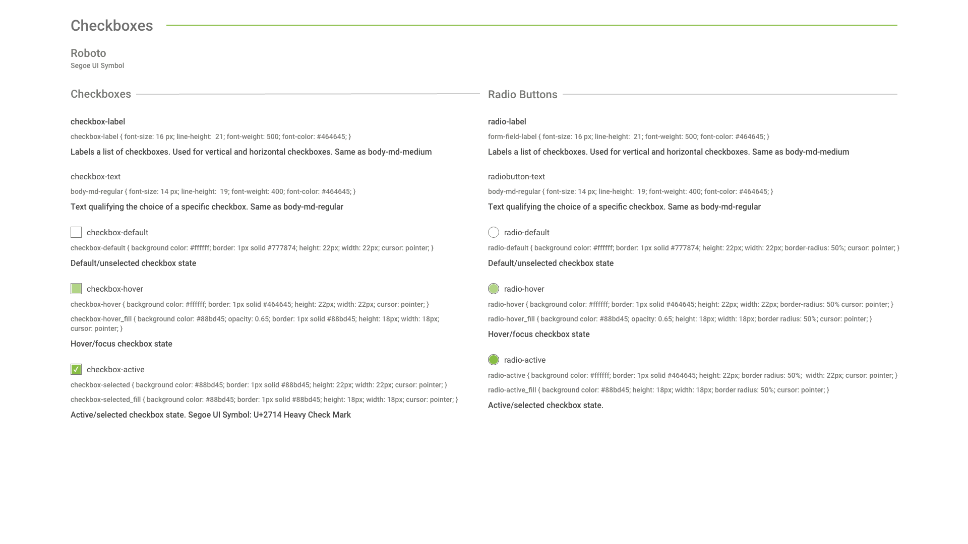
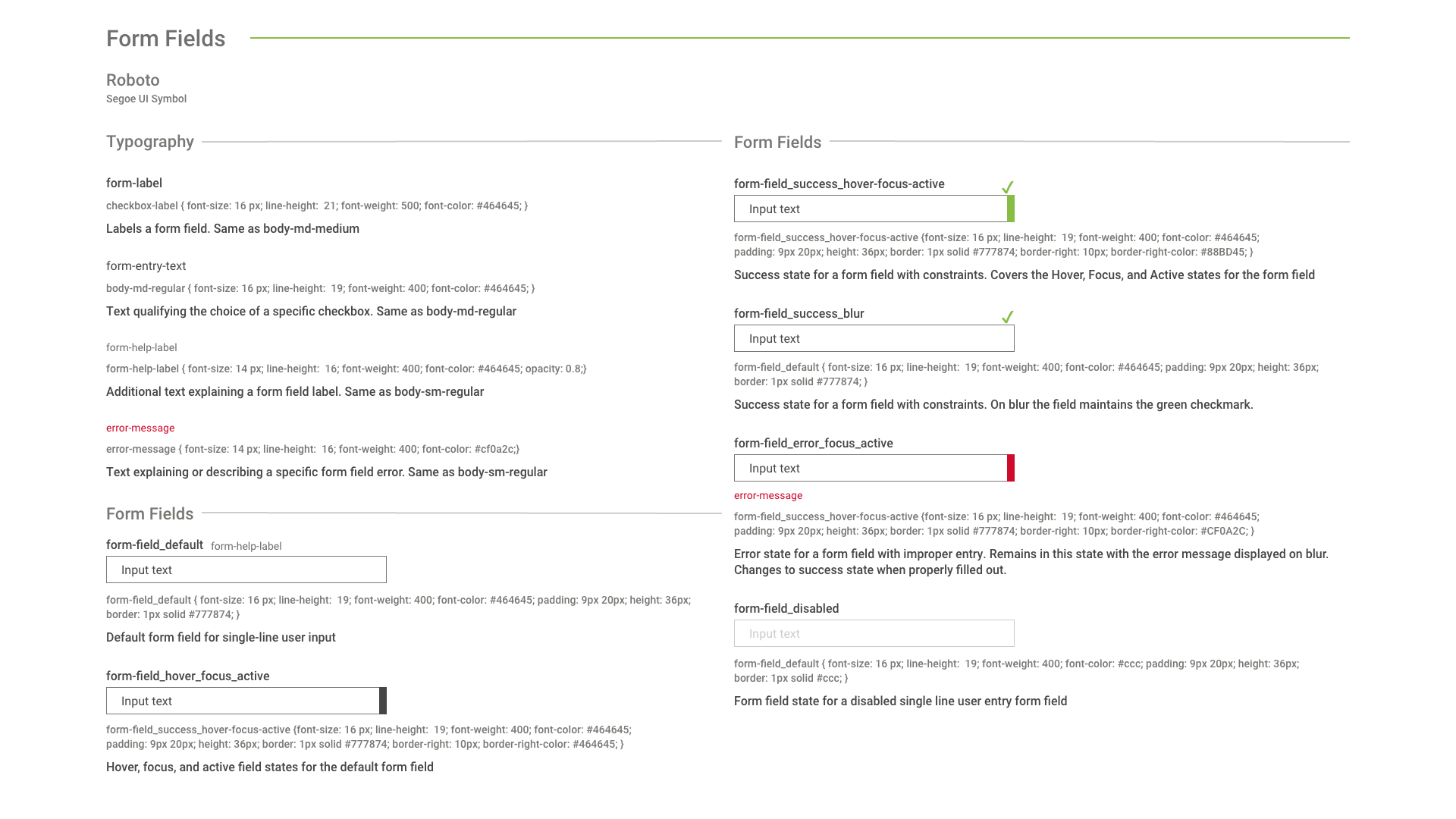
I provided initial designs for the UCS platform, including sketching wireframes and UX design, making prototypes, and creating style guides — a visual style guide and a style guide for repeatable content such as help text, error messages and form fields. I designed external and internal facing functionality.
Learnings
I quickly found that UX design approaches and collaborative working was not part of the culture of this organization. Nonetheless, I was able to establish a personal relationship with the project stakeholder so I could get feedback from end users on my designs. This input proved invaluable in creating a more usable portal experience. I learned that even if you can’t have official stakeholder participation in UX, it’s absolutely worth pursuing workarounds to get user input.
Style guide
Below are some samples from the style guide I developed at Freddie Mac for the Unified Counterparty System
Wireframes and Prototyping
While building the style guide and designing the wireframes I wanted to maintain clear readability and text that met a AAA WCAG accessibility standard. I advocated for flush left form fields with text entry below the form field labels, informative flavor text, and persistent feedback like a green check or red ‘x’. I advocated for nomenclature that applicants understood instead of just using internal terminology. User testing was, unfortunately, a bridge too far.
Below is a user flow I made for the internal facing tool to edit the application forms. The digital version of this and other user flows were lost, but I recently found some preliminary sketches in an old notebook.
Below are some screen grabs from some of the wireframes I built. They were all built as fully interactive prototypes using a program called JustInMind.
Above is a mashup of several wireframes, which shows the application tracker I designed and advocated for at the top of the form. The wireframe itself is of an administrator page where an administrative user could toggle to display or remove questions from the core application, and change or edit text.
Due to backend constraints the total number of questions cannot be changed so hidden blank questions would be added up front for the addition of new questions should the need arise


